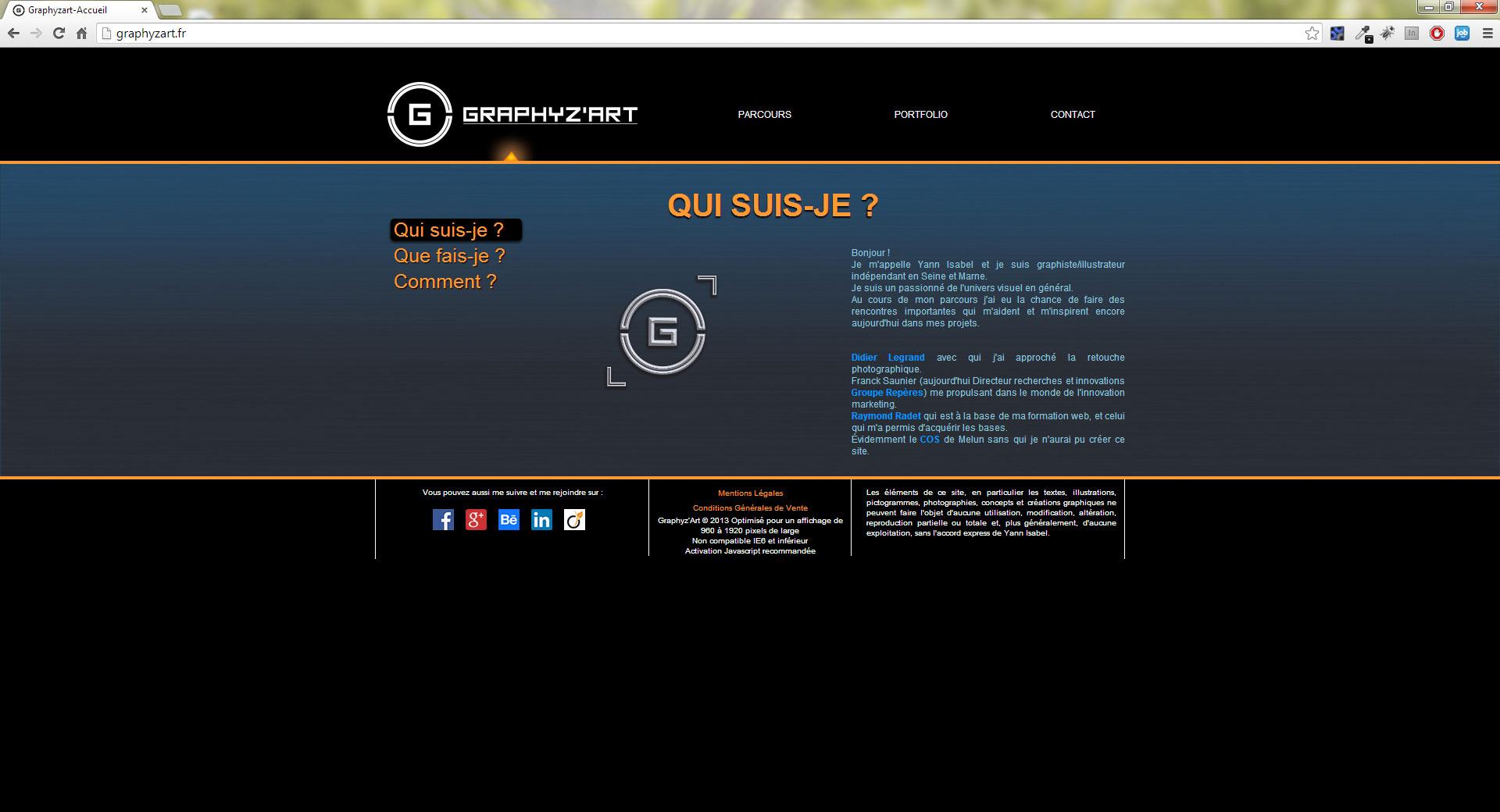
graphyzart.fr was my first website online. It was in 2013
Date:
Description: Development of a personal website to showcase my work and introduce myself
Type: Webdesign, Frontend Development
Tools: Visual Studio Code, React, Next, Sass, Webpack

Since I work I have a portfolio. When I was Graphic Designer I had an online portfolio on behance and a book with my main work printed on glossy paper.
When I started working on the web area it was obvious for me to create my own portfolio. It was the first website I developed during my first web training.
I really like to take screenshots of my old projects. When I look backward I realize what I have accomplished. It's very important for me to do that because it helps me to see my progression.
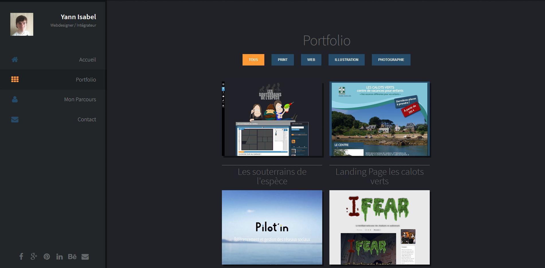
Here is a little preview of the evolution of my portfolio over the years

graphyzart.fr was my first website online. It was in 2013

graphyzart.fr became a blog on visual art and I created a new website for my portfolio in 2015 on yannisabel.com
The thing that makes me laugh is my color scheme. Since I started working on my personal website I always kept my blue and orange colors. Currently I know the hexadecimal code by heart.
The first website was in between skeuomorphism and flat design and the second totally flat (even the shadows).
Both used only HTML, CSS and jQuery.
First of all I asked myself why I wanted a personal website and what will be the purpose of it?
I wanted to share my experiences, knowledges, thoughts, my work and introduce myself. As simple as that. My life has been built around sharing things and my professional life doesn't have to be an exception, especially since the web area was created for that.
As this website is totally related to me as a person I had to create something that reflects my personality. To be honest this is the most difficult part as I'm evolving a lot and my tastes change with time. As Design System Engineer since a long time I always think about system in design for a lot of projects so I had to create my own to help me update things quickly.
I'm a musician since I was a kid so it was natural for me to think about a music correlation with my way of building interfaces. So I created my own Design System called Orchestra.
An orchestra can take multiple forms depending on the stage size, the masterpieces that will be played or how it will be played. Each group of instruments of an orchestra is called a section and each section can be modified or removed to fit the needs.
It was the best musical allegory to represents a flexible system.
To make my system flexible and adaptable to any functionnal differences depending on the project the idea was to be the most atomic possible. The Orchestra Design System is divided in 3 main groups:
| Name | Web definition | Music correlation |
|---|---|---|
| Notations | Gather all properties and helpers which will be used to create components | Tools following rules that helps composers and musicians to write and play music |
| Staves | All the smallest components that cannot be splitted in multiple parts without loosing their functionnality. Idealy one Stave have only one function | It will create order and rythm to the music notation |
| Scores | This is the result of multiple Staves together that create context | The sheet that will create music pieces |
Music is a language with multiple parts in it. From the notation to how the music is played or how it sounds there are plenty of rules and guidelines to follow to call it music and not only sound.
I will follow the same idea to construct my system and continue improving it.
yannisabel.com was written with React, a javascript library that helps to create interfaces with ease with a logic of components that can be updated independantly. In the old way it was difficult to update certain element at a certain moment and sometimes it was not really interactive because we had to refresh a page to update a component.
With all the new javascript frameworks and libraries (it's been a while now) it's common now to have a lot of interaction and a lot of updated components without any refresh. Pretty cool, and it comes with increased speed rendering. The only problem is the fact that all the html is generated by javascript. So the accessibility and the referencing are put in the trash.
Fortunately, some frameworks was created to handle that by generating static websites from javascript applications. For React, one of the most famous is Gatsby, but to be more flexible I turned to Next.
Since my experience at PayFit I code with typescript and don't really know how I did before without it. It's also very suitable to type design tokens and so this is great for Design Systems.
One of the things that I like with my current website is that all my portfolio pages (like this one) are written in mdx. It let me import my own react components inside markdown syntax so I can keep design consistency and write content with ease.
My portfolio seems to be related to my personality and I think it's the best way to think about a product. It has to be related to its purpose.