Midnight PayFit Design System
Date:
Description: Frontend development and creation of workflows on Midnight, the PayFit Design System
Type: Frontend development, Design System, Project Management
Tools: VSCode, React, Typescript, Midnight, Component library, Inner Sourcing, An excellent team, a lot of fun
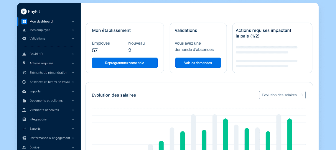
What is PayFit?
PayFit is a cloud-based solution for running payroll. Companies can use this app inside their organization to better manage the payroll, the expenses and leaves of their employees.
For my part I was in the Midnight team working on the Design System of PayFit which has the same name.
The project
When I joined PayFit I already knew the product as I was using it as an employee in other companies. I was already convinced that the product was useful and well established.
The Midnight team was responsible for the UI and the UX of PayFit as we were creating components, guidelines and tools used by feature teams on the product. To understand more how we worked as an hybrid team, I wrote an article on the PayFit's blog.
What was I doing?
My role was to develop and maintain the technical part of the component library with 3 other developers.
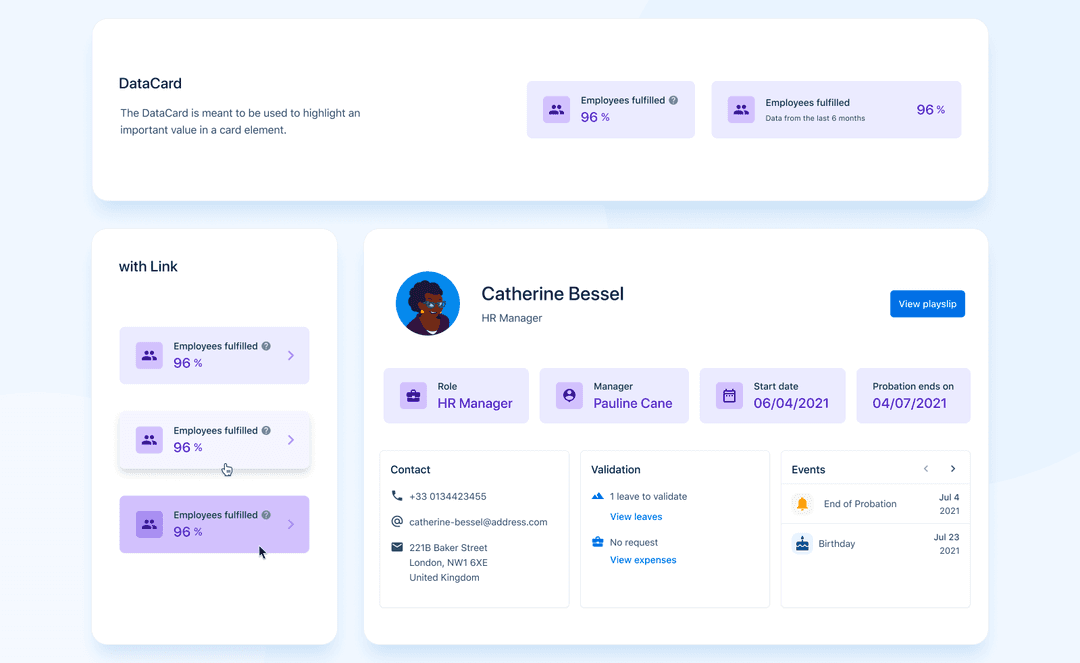
The DataCard component is one of the components I created in collaboration with one designer of my team (
look at it on this dribbble shot
)
My second role, as we were working on an hybrid Design/Tech team was to elaborate with my teammates some workflows for our own team but also with other teams of the company to make sure that the Design System we were creating was well used, well understood and also efficient enough for our consumers usage. This is maybe the most important part on the Design System work: The collaboration.
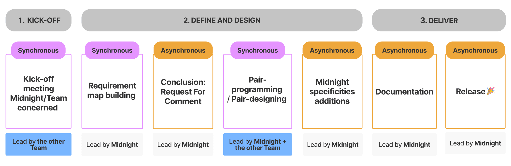
Inner Sourcing
Even if we owned the Design System and its libraries, as a team we didn't worked so much on the product side. Elaborating new components, new features or updates couldn't be made without feature teams which were working directly for the end user on the product interface itself.
So we decided to create a workflow to help feature teams to contribute to the Design System as soon as they have a new need.
After some collaborations with this workflow we found that the process was too long (around 1 month from start (needs) to finish (deliver)), it was time to revamp it with all the feedbacks we had at this time and we created the version 2.0.
It was shorten by 2 weeks just by adding most of the process on our team shoulders (Midnight specific spec (tech/design side), tests, documentation). The feature team had only to express the need, participate to a peer design session and a peer programming session before letting us doing the rest.
It was one of the things we were most proud of because it helped us accelerate the evolution of the Design System and also allow feature teams to be involved in this evolution.
Afterwards some of the developers and designers who participate to this process were also more autonomous to participate to a new one or just to collaborate more with us (bug fixing, quick update).
The Navigation revamp
Less than 6 months after my arrival at PayFit I worked with a Designer in bi-force on the biggest project I worked on during my professionnal life. It was challenging, with a lot of stakeholders, making a big impact for the company, for our team but also for our end users.
The goal was to redesign the Navigation of the application by creating a new component in the Design System library and implement it ourselves.
What we planned and organized together:
- Discovery:
- Audit of the current Navigation at this time (gathering infos, resources, feedbacks and possible redflags)
- Benchmark of other solutions in terms of UX and UI
- Creation of a Lo-fi Figma prototype with the global idea of what we wanted to achieve
- User tests on the Figma prototype:
- Internal tests: we organized test sessions with our coworkers who were using the most our product as a user or were in contact with the end user (Product builder, Customer Success Manager...)
- External tests: we organised test sessions with some of our end users
- Summary of the Discovery
- Design:
- Create a final version of the Navigation component on Figma with all variants
- Development:
- Create the component following the Figma file
- Implement it on the product
- Delivery:
- Make a release for all countries (4 at this time: France, England, Spain, Germany)
The plan was good and we thought that one quarter was enough to do it.
Quickly we saw that it could take more time than we planned. This was the first time that Midnight was working on something that huge and we discovered how to work with teams we didn't work with before.
The component was done in one quarter as we planned but the implementation and the delivery took way more time than we thought.
We had to find how to implement a component conditionally. A flag that allows to display a feature for some account or not. A lot of companies are using this method for A/B testing, beta testing etc...
As all countries were not ready at the same time to welcome the new navigation, we decided to create a beta version on several accounts during 3 weeks, gathering feedbacks and deliver it country by country after resolving the bugs found by customers.
To do that we collaborate with a Product Marketing Manager to help us organized the delivery of each country at the right moment and also make sure that all marketing teams were aligned with all the update to make on their side (documentation, help center, testing account...)
The reality
Finally instead of one quarter it tooks almost one year until the last country migrates to the new navigation. We didn't had so much bugs to fix, the whole navigation worked as expected but trying to coordinate the schedule of all teams of a company of over 1000 employees could be very difficult and take a lot of time.
In the end all stakeholders were happy with the solution we proposed and prefer the new version to the old one, even if it was a breaking change for a lot of people.
Conclusion
This experience led me to think about my own career path. As an hybrid designer/developer I always wanted to work on both sides and I did. The design system area is a great opportunity to be at the middle of both worlds. But to be totally honest this experience also open my eyes on my wish to be more between them than only developer or only designer. So my journey to find my path is not over and today I will try to focus more on the collaboration helping teams working together by finding the right workflows and the right tools.