Sass Gutless Grid
Date:
Description: The challenge of creating a complete grid system with SASS mixins
Type: Frontend Development
Tools: Sass, Codepen, Node, Gulp, Github
- Github link
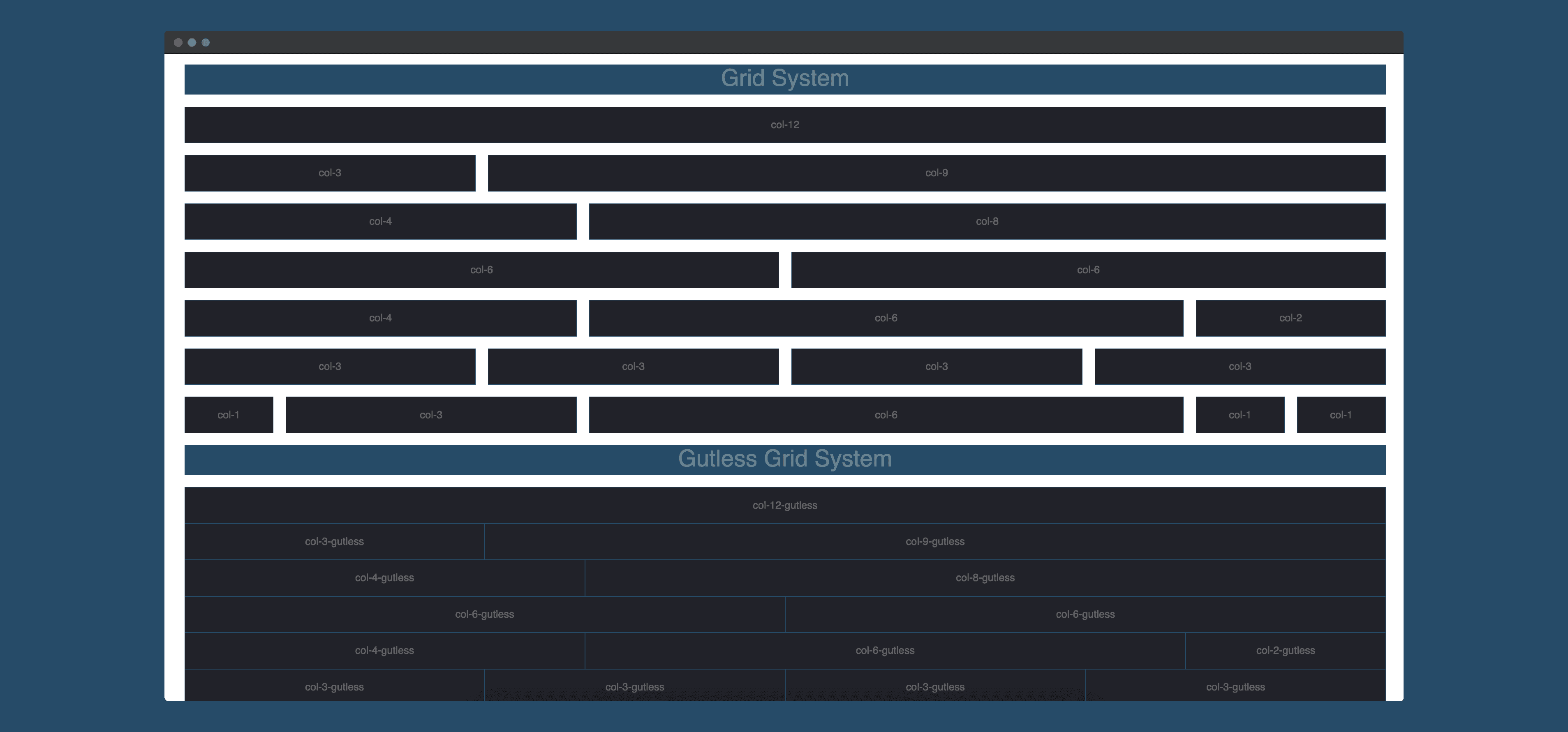
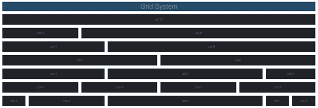
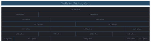
Grid made with SASS mixins
First of all you have to know that creating a CSS grid is something that is very common. There are many articles that explain how to generate a grid using SASS, so my goal was not to recreate the same thing. So I looked at different ways of calculating column widths based on the number of columns and what were the elements to consider in order to calculate the width of these columns.
Of course, when doing this type of research, we often come across the excellent Kitty Giraudel who is often taken as a reference when talking about SASS.
On my side I wanted to build a grid a bit like Bootstrap, 12 columns and the generation of class with the calculation of their width.
The name of the grid comes from the fact that when creating a grid the spaces created by the gutters looks like a kind of path through the elements. In English Gutter and Gut are very close, it's even an excellent image of what are actually the gutters of a grid. So I started with the idea of creating a grid with or without gut, Gut or Gutless (the true meaning of Gutless is rather having a lack of courage).
Most of the grids found on the web have either a gutter that is always taken into account in the calculation of the width of the columns, or on the contrary have no gutter at all. But there is no option to define the gutter using the same grid. What I wanted to create is a grid that would manage the gutter without having to change the grid or adding a margin-left by myself each time I create a new grid.
How it works
To summarize the computation of the width of my columns is done via mixins which contain 2 arguments (the number of the column and the existence of a gutter or not). Of course with this grid it is possible to have elements with an offset. Here is an overview of the mixins integration.
// grid.scss

.col-#{$i} {
  @include grid($i, true);
}
.col-#{$i}-gutless {
  @include grid($i, false);
}
.col-#{$i}-offset {
  @include offset($i, true);
}
.col-#{$i}-offset-gutless {
  @include offset($i, false);
}
Today it's easier to do the exact same grid with Grid Layout but when I created this grid I never tried it, and the compatibility of the grid layout with browsers was not the same as now.
Result
To see the whole code you can go to my github repository, otherwise here is the preview on Codepen: